Showing posts with label depend. Show all posts

Saturday, May 17, 2014

Didn't die

Hiya! Just so you'll know I didn't die on you, here are som re-instas.


From OPI Brazil: Where Did Suzi's Man-go? and Kiss Me I'm Brazilian.


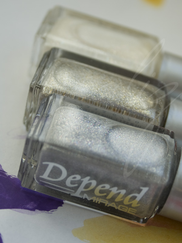
Some Depend Mirage, probably 2055 Bronzy Breeze. very nice gold (!) foil.


Rimmel Torrid


Orly Androgynie


a-england Encore Margot

And if you wonder why I'm silent: I got too much to do. I rarely have any decent time off, that I don't use for absolutely nothing. I got a new temporary job, doing my political and union stuff, and on top of that I'm a single mom at somewhere around 95 % of the time. But I'll be better. I promise. At least I'm happy.

Wednesday, February 12, 2014

New collection quickie: Depend Rough Sweet

For those of you who aren't yet tired of texture polishes, or pastel polishes for that matter, Depend releases a twelve piece collection of such shades, called Rough Sweet.


Though disputable whether all of these colors are really pastels, they are kind of soft in tone. At least the ones I tried quick stick swatches of. Here are my picks from the collection, clockwise from top:


2100 Sweet Candy (lilac with very subtle pearlescent shimmer), 2098 Sweet Mint (pale minty green), 2097 Sweet Jelly (spring green with small iridescent glitters), 2094 Sweet Sour (pale yellow with small iridescent glitters), 2095 Sweet Bubble (pale, cool pink), and 2093 Sweet Sugar (white with very subtle pearlescent shimmer).

Three from this collection have the little iridescent glitters to keep them interesting, and apart from the above two, it's also present in a caramel colored shade that I would probably never wear even at gunpoint. Except for these, all have some sort of shimmer that isn't really apparent because of the texture. They're soft and sweet, but not necessarily interesting in themselves.

As usual when Depend releases specialty collections, these come with a bigger price tag than the standard spring and fall collections. At SEK 39:-, these 5 ml per bottle have a high unit price. But if you're really into this sorta thing...

Tuesday, November 5, 2013

Re-re-re-insta!

These are the last ones - promise. Well, at least for now...


Finger Paints Twisted over Orly Glow.


Depend 387. Love this finish!


Kill it with fire, pt II: China Glaze Bend Over Backwards with the orange-yellow-green flakie gradient over (I've forgotten which one of all those I used this particular time).


Smitten Polish Electric Lime. Best (neon) green holo ever.


Last days of summer: Essie Boom Boom Room.

Beware of continuations to this type of posts in the future.

Sunday, May 26, 2013

Depend's better half

This is not a post on the marital status of a Swedish nail care company, but simply one showing off about half of their summer collection in the form of skittles. Yes, I felt like skittles, for almost several minutes after this manicure was finished.


Did you miss my trademark sideshots? Only my compact camera can manage them.


This instagram picture is actually the fiercest one.


Did you miss the entire nail community's claw pose of the later part of this century's first decade?

So, to sum this up, and to make my point: like so often, Depend uses a recurring finish throughout a large bulk of the collection, and for summer, that is duochrome glassfleck shimmer, woohoo! There are five colored jelly polishes with the afore mentioned finish, as seen in the above photos, and to help all us crazy duochrome ho bitches out there, 1/12 of the collection is a clear layering polish with the same shimmer. Technically, it's multichrome, but mostly visible is the blue to pink range. One may argue, though, that the direct angle color is more aqua, and then moves all the way to golden, via blue, purple, pink and copper. But you'll have to be very forgiving, or very nerdy, to find all that. And most of all, some of the spectrum is buried in the colored bases.

Do these make me a happy alizarine? Of course they do. And unlike all of Depend's specialty collections as of late, these are all regular collection colors, so they retail for the standard price of 25 SEK.

For data purposes, the shades shown above are, from thumb to pinky: 372, 368, 361, 366, and 367. The number of the layering shimmer is 363 - surely you could just snatch that one instead of all the above ones, though I have to say I like the base colors of these also. Very summery, except perhaps for the grey 372, which would perhaps be more fitting on a rainy day (also, the formula of this particular one was a bit icky).

If you're wondering about the rest of the collection, because yes, there are six more polishes, they aren't as exciting and probably won't make it onto photos in the near future. Among others, there is a re-release of a terrible white frost with utter streakiness (no. 38), that I can not for the life of me figure why the Depend peeps would bring back. Then, there are cremes in the spectrum of berry, orange-red, coral, yellow and a sorta 60's semi-pastel green, but less appealing than it sounds. You'll probably be able to find those elsewhere.

These products were sent for review.

Swedish word of the day:
sommarregn -noun summer rain
Not that bad after all.

Tuesday, March 19, 2013

A Golden Black Mirage

It took me a while (obviously), but here is one of the requested swatches from Depend's Mirage collection. Not terribly sharp in photo quality, here is 2052 Golden Black.


Two coats of delisciousness. Very well pigmented, very nice large golden flecks in perfectly black base.

Still, will you be getting this at 39 SEK?

This product was sent for review.

Swedish word of the day:
svärtad -adjective blackened
This golden hue is.

Saturday, March 2, 2013

Depend Mirage

Over the last year or so, Depend have been releasing collections other than the usual spring and fall ones. Specialty collections such as magnetics, holographics, and now, ...shimmers. Let's take a quick look at Mirage.


Front to back: 2051 Shattered Silver, 2050 Shimmering Sand, 2049 Fairy White.


Front to back: 2052 Golden Black, 2053 Treasury Gold, 2054 Glistening Green.


Front to back: 2055 Bronzy Breeze, 2056 Razzle Rose, 2057 Beaming Berry.


Front to back: 2058 Sheer Violet, 2059 Starry Blue, 2060 Twinkling Silver.


First impression of this collection is that it is a rather nice one, and some shades are actually very alluring, in a weird, delicate way. However, is the 60 % increase in price really necessary here? This limited edition collection is already in stores, and here in Sweden they go for a affordable but less tempting 39 SEK (~6 USD) - remember, Depend polishes always come in 5 ml bottles.

If you'd like swatches of any in particular, just give me a holler in the comments.

These products were sent for review.

Swedish word of the day:
hägring -noun mirage
Watch out for dehydration!

Friday, December 21, 2012

Depend spring 2013 bottles and more...

A quickie today to show you the coming spring colors from Swedish Depend Cosmetics - quite a colorful collection!


Pinks, peaches and oranges... 346, 347, 348, 349 and 350.


Turquoise, blue, purple and lilac... 351, 352, 353, 354.


...and green and yellow! 355, 356 and 357.

No wheel swatches this time, as Sweden proved to be too gloomy for any decent photography sessions. However, there is an interesting theme in this collection: several of the lacquers have a very fine green shimmer, mixed with sparse glass flecks. I wish the green shimmer was more prominent, but I love the idea, and for one of those recurring finishes throughout a collection that Depend seems to specialise in, it is a fun one. The orangey red 350, the turquoise 351, the lilac 354, the yellow 356 and the lime green 357 all have this combination of particles, while the sheer peach 349 is a more classic glassfleck. Then the cremes of course... Although not all of these are totally breathtaking and inventive, it's quite a cheerful bunch, which is something I like in a spring collection. Thumbs up from me this time.

The Depend peeps also sent a bunch of releases for Christmas, and among them were a few samples of a collection of chromes, foils or possibly metallics that go by the name Mirror.


A dark and gloomy wheel - this is 2048 Java Dusk, 2039 Pixie Pink, and 2041 Frosty Lilac.

Metallic? Sure. Foil? Perhaps, in some cases. Mirror like finish? Definitely not. But perhaps the name of the collection is not to be taken literally. There are also green and blue hues, among others, in this collection, but I haven't seen those - I wish I had, though. These few examples don't really tickle my fancy, but I'll always find use and the appropriate time for a good gunmetal shade, so I'm sure 2048 will be satisfactory to wear a good day.

All products were sent for review.

Swedish word of the day:
spegel -noun mirror
To be loved or feared...

Tuesday, October 16, 2012

Depend on..?

And now something entirely different. As I mentioned in my previous post, Swedish fall is now fullblown and dark and rotten. So to be able to swatch anything at all, I had to completeloy turn myself around and do flash lit swatch photos, in the evening, at my kitchen table. Also I'm holding bottles - very rare. What is it I'm going to show you? Some of the previously quick swatched Depend colors for fall. I picked out the ones that had me the most intrigued. Behold.


324. Ultramarine sorta blue creme. Lovely shade. This is two so called generous coats, but to be safe, three thinner coats would be better. Please excuse the small smudge on the pinky nail.


325. Green base with blue shimmer. Another lovely shade. This was two or three coats - I have sadly forgotten.


326. Teal green creme. Also needs three coats. Perhaps not very unique, but a nice shade of teal.


331. Very sheer blue jelly with blue and purple small glitters. Not really sparkly at all, mostly weird. Even in the dim kitchen lamp light you can tell this is the kind of jelly that makes your nail line look gross, but if you're into that, and weird blue jellies, perhaps three to four coats of this is what you want.


334. Off-white jellyish creme with pink and unidentifiable (are they white? silver?) small glitters that adds texture and a speckled look more than actual glitz. This was two good coats. While 331 may be perceived as a huge failure, 334 certainly has its qualities, in that it's a bit unconventional despite its feminine, classic colors. This is like crushed candy cane in a bottle, or like Swedish polkagrisar. Sadly, this is a very gritty polish, and that's why I'm hoping a smaller or independent brand will make a more eventful polkagris polish - perhaps for Christmas?

I have already provided you with my thoughts on the collection these are part of, but as these have now been swatched on actual nails, I may add that I'm still a bit disappointed in the pigmentation of these. Depend have a previous track record of great coverage, which is always preferable when keeping in mind that they come in 5 ml mini bottles, but the cremes of this collection needed more coating than I'm used to from Depend. I hope this problem won't persist in future collections.

That aside, some of these are really nice if you're into the less conventional colors.

These products were sent for reviewing purposes by the manufacturer.

Swedish word of the day:
godis -noun candy
Could use some.

Wednesday, September 19, 2012

Depend fall 2012 - bottles and wheel

And now for something entirely different. An ordinary fall collection! And it contains very little (or small) glitter. Let's have a look at what Swedish brand Depend has to offer this season.


318 - mint green with frosty shimmer, 319 - nude creme in the pink spectrum, 320 - berry creme.


321 - dusty mauve-ish purple, 322 - strongly green tinged grey creme (or very greyed out green creme), 323 - berry shimmer.


324 - an ultramarine sorta blue creme, 325 - dark green with blue shimmer, 326 - teal green creme.


328 - sheer yellow jelly with yellow glitter, 330 - warm red jelly with dark pink glitter, 331 - sheer blue jelly with blue and purple glitter.


334 - candy cane like glitter, a warm white base with pink and unidentifiable glitters, 335 - small holographic glitters with a few small holographic hex glitters in clear base - the numbers in this photo have been mixed up! (sorry)

And directly to the wheel - for some reason these photos have a weird yellow tint despite using a correct white balance setting, but I've tried to color correct them back to reality, or at least as close to it as possible. All are three coats, no matter if they needed it or not (more on that later).

318, 319, and 320

321, 322, and 323

324, 325, and 326

328, 330, and 331 - for your convenience, I have topcoated this
group of swatches, but they are still rather gritty

334 and 335 - 334 is also topcoated, and not this yellow

All over the place, this fall collection as usually provides a little something for everyone, from the color fearing to the color embracing person. Thrown in, a bunch of hard-to-describe glitters - what are they supposed to be? This isn't all that clear. So let's begin by scrutinizing those (god knows I have been). At first glance, upon receiving these bottles, they caught my interest - what are they, really?! - and as I painted them on the wheel, I was more and more puzzled. I tried them as topping glitters over some of the other colors, I examined them in one coat, two coats, three coats... Fairly gritty, I was staring to wonder if they were meant to be. They sure aren't pretty, so perhaps they are meant for some new, weird, über-cool effect? I still don't know, all I know is I think the yellow 328 is absolutely terrible, 330 just doesn't work the way it's formulated, and 331 is worth a try on actual nails. As for 334, which seems to have a more opaque base, it still really catches my eye. A candy cane (Swedish polkagris) colored glitter?! I will have to try it, despite the doubts I have towards it's formulation and provided type of glitter. (335 is not worth more than a parenthesis - it's an unattractive variety of holographic glitter with very few slightly larger hexagonal glitters thrown in. In three coats I managed to fish up two of the hexes, barely noticeable in the swatch above because they ended up on the sides. There are far better options out there, just leave this one on its shelf.)

Let's move on to what is the more conventional parts of the collection, which is in part well done. There are plenty of repeats and bland colors, such as the two berry ones (320, 323), and the purple mauve 321. Then there are the ones that makes us think of what the huge brands are putting out, such as the grey balancing on green 322, and pink nude kind of color in 319, and then there are the completely uncomprehensible choice of putting the frosty mint 318 in this collection.

What does this leave us with? The blue creme 324, the green and blue shimmer 325, and the teal creme 326. I guess it wasn't that farfetched, reading this particular blog, was it? 324 may not be that original, but I always fall for those vivid blues - this one perhaps not the most vivid I've ever seen. Depend describes it as a cornflower blue, but I disagree and would like to call it an ultramarine blue. It's nice, but like too many shades in this collection it has an opacity problem. A three coater creme is not what I expect from Depend, and keeping in mind that these bottles are minis containing only 5 ml, that's basically a two-manicure bottle. 325 is a gorgeous shimmer if you happen to be a lover of greens, blues and teals. It is like the less fabulous sister of a Korean lacquer I was lusting over a long time, namely Skin Food Cucumber. If you can't get a hold of Korean products, but Scandinavian, pick this one up instead. A teal creme may not be that special, but 326 is a nice shade. I know all the subcultural teenage girls here will pick it up. It also has a pigmentation problem, but that renders it a little more squishy than your average one coater creme.

Another wordy review of a Depend collection. In large, this collection gets a pass from me, but just barely. The truly weird glitters kind of ruin the overall impression of it, which drags it down a notch or two. As usual, I'm sure everyone will find something to their liking here, which is still Depend's forte.

As a side note, though not required in Sweden, I have decided to start stating when products have been bought with my own money or when they were gifts for review by the manufacturer or a PR representative. I know many trust my honesty, and I refuse to change in my honest ways, but clarification could always be desirable, especially for residents of countries where stating acquirations is mandatory when blogging. You will find this note at the bottom of every post - I'll try to edit past posts to reflect this, to the best of my abilities, as well.

These products were provided by the manufacturer or PR representative for reviewing purposes.

Swedish word of the day:
spretig -adjective straggle
Best way to describe Depend collections - good or bad?

Monday, June 4, 2012

It Depends

Let's show some full manicures with a couple of the new Depends - these are the ones I've tried so far.


First up, 305. Three coats. Rather sheer for a Depend, and still some visible nail line, as you can see in the top photo. The base color is some kind of bright, warm Barbie like pink, and the shimmer is actually green - though most of the time it looks mostly golden. The pink combined with the shimmer gives it a peach color look, and despite being so cute in the bottle, and in theory, it made me feel like an old lady. Even my mother in law said it didn't suit me, and like something she would have worn in the 80's. I think a lot of people will like this, but it's not for me, and it only lasted a day before I hit the remover bottle.


I changed to the very tempting 313. This was three coats also, but much more satisfactory than the previous. The MIL gave her approval. "That's much better." And yeah, it is. Blurple with green shimmer flecks? Yes, please!

Swedish word of the day:
byta -verb change
Sometimes you have to.

Monday, May 28, 2012

Depend summer 2012 + giveaway

Finally, some bottle photos and quick wheel swatches of the new Depend summer collection!


This little bunch is a rather cute set of tutti frutti like shimmers. 305 is a warm bubblegum pink with fine green shimmer that dries semi matte, 306 is a yellow, fine shimmer on the cooler side with a green cast, 307 an orange with gold shimmer, and 308 a red with gold shimmer. Sorry about the rather dark photo here.


309 is a red with fine, somewhat frosty shimmer, 317 a sheer pink with a pearly violet or pink shimmer, 311 is your average semi bright raspberry pink creme, and 316 a lilac creme with green shimmer.


314 comes out wonky in photos, but is really a bright green creme in a sort of cross between apple and warm mint kind of shade, if that sounds weird it's just because I haven't had enough coffee yet. 310 is a blue foil with particles on the more coarse side, 312 is a taupe creme with green shimmer, 313 a blurple with green shimmer, and 315 is a peacy nude with green shimmer.

Let's take a closer look at 313:


Rather nice!

And now the wheel - this is with flash, polishes in number order:


Close up shots of some of my favourites:


312 and 313.


305-308. It's not that they are so damn unique, but they look so cute together.

So, what's cool about this collection? It's got green shimmer all over, in different sizes. That makes some of the colors one would expect to be more standard, just a little less standard. I've also been trying to figure out if that shimmer could have any duochrome properties, but I can't really tell, which means that if it does, it's not that obvious anyway. Still, I rather like a bunch of these shades. It's definitely a huge step up from the spring collection, which was infinitely boring. Some of these I don't think I would wear myself, but I can see why people will buy them. For instance 307 and 308, which are cute, but not my personal style. I have tried to figure if those also has the same green shimmer the rest of the shimmers do, but if it does, it's eaten up by the base colors.

My favourites are of course the collection standout 313, and also, perhaps a little unexpected, the taupe 312. It's not just another taupe - it has green shimmer dammit! Lately, as I'm accepting this aging thing going on with me, I've grown more fond of neutral and classic colors with the small, sometimes unexpected twist. These shades sort of allow me to be the obstinate me I've always been, but with less noticeable nails. The edge is there, but only if you look closely. And sometimes knowing is enough.

Also, I would like to add that the pale lilac 316 at a distance looks a whole lot like Essie To Buy Or Not to Buy, though the shimmer is different. This is even more so because it has the same general problem the Essie does: the shimmer pretty much drowns in the creme base. It's just not that visible. But if you're in an area where Depend polishes are sold, and you wanted to get the Essie, you could do with this one instead.

For Depend polishes, these are sheerer than usual. Many of these will require three coats if you're like me, but maybe only two if you're more normal. The typical Depend one coaters aren't found, except for perhaps the blue foil 310.

Definitely one of the better collections from Depend in quite a while. I can see 313 becoming a classic, and I think most of these shades will sell well for summer. Some are pretty bland and less interesting, but adding the little extra to classic and neutral colors is great.

And now for the twist: Depend accidentally sent me two packages with this collection, so we decided together that the extra set would be a great offer to my readers. If you would like to receive AAALL the above colors at once, just leave a comment on this post with your email address. Open to all, until Sunday evening, June 3rd, 8 PM CET (GMT +1, summertime).

Swedish word of the day:
färglada -adjective pl. colorful
Summer collections should be.