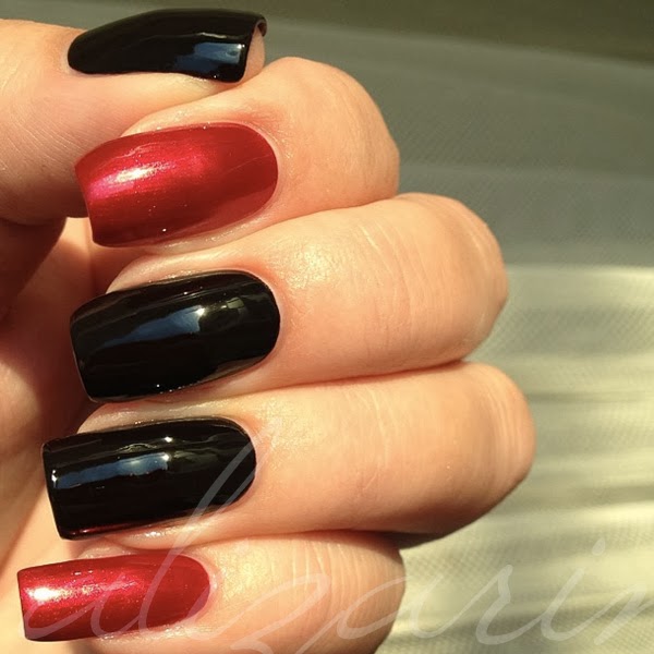
Updates are scarce, I know that, but let me apologize for my otherwise hectic life by letting you know that manicures aren't nearly as scarce - I've posted most of them on instagram. So let's have a few sucktastic cell phone pictures, shall we?
Misa Grey Matters, mattified with Essie Matte About You topcoat.
Revlon Mistletoe with added Essie As Gold As it Gets gradient.
Orly Ignite, with Essie Matte About You.
A-England Lancelot and OPI In My Santa Suit. Reversed order on the other hand.
Nicole by OPI Just Busta Mauve.
...and again. Truly spectacular, that one.
I have more stuff like this. So many manicures never eneded up being shot with a decent camera, but rather snapshot with what seems to constantly be in my hand: my phone. Though I have like four months worth of real manicure photos waiting in the pipline, so hold on to your hats.
Showing posts with label copper. Show all posts
Monday, October 28, 2013
Friday, February 1, 2013
OPI in Euro Centrale - bottles and quick swatches
On OPI's journey around the world, the next stop is in central Europe to celebrate spring, with Euro Centrale. With that dreamy lede, I'd like to show you the bottles and quick wheel swatches.
Counter-clockwise from left: Vant to Bite My Neck?, Polka.com, You're Such a Budapest.
Counter-clockwise from top left: OPI... Eurso Euro, Can't Find My Czechbook, I Saw... U Saw... We Saw... Warsaw.
Counter-clockwise from top left: Hands Off My Kielbasa!, My Paprika is Hotter Than Yours!, Suzi's Hungary Again!.
Clockwise from bottom left: A Woman's Prague-ative, Oy - Another Polish Joke!, My Vampire is Buff.
And the wheel swatches:
Polka.com (small blue and magenta glitters, and larger blue, magenta and turquoise hex glitters in clear base), Vant to Bite My Neck? (vampy grape purple creme), OPI... Eurso Euro (saturated yet dark indigo blue creme).
I Saw... U Saw... We Saw... Warsaw (dark Prussian blue creme), Can't Find My Czechbook (turquoise-blue creme), You're Such a Budapest (lilac creme with subtle silver shimmer).
Suzi's Hungary Again! (bright pink-coral creme with fine silver shimmer), My Paprika is Hotter Than Yours! (bright warm red with fine silver shimmer), Hands Off My Kielbasa! (tan beige with fine coppery pink shimmer).
A Woman's Prague-ative (golden copper shimmer), Oy - Another Polish Joke! (yellow-golden shimmer), My Vampire is Buff (light beige creme).
Are you feeling the Eastern European vibe here? This surely is a collection full of stereotypes and simplification. Let's see... Two vampire jokes, three food and eating related names, three silly jokes with the pretention that local names have English meaning ...and, you know, the list goes on, in the usual OPI manner. We've learned to live with it, but sometimes it's bordering ridicule and exotism, which, by some more prone to analysis, could be perceived negatively. While Prague-ative is a less terrible play with words and names, the OPI team already used it once before, for It's My Prague-ative! (European Collection, 2002). The drained imaginations circulating the OPI offices are painfully obvious.
If we manage to forget the names for a while, they are actually plastered onto polish colors. Many good, some great, some less intriguing. The cool-toned half of the collection is bound to be the favourite of the less conservative youth, with the most outstanding member in the deep but vibrant indigo blue OPI... Eurso Euro. Can't Find My Czechbook is a very nice shade as well, though I think many lacqueristas will find that they have a bunch of similar colors already -that doesn't remove the fact that it is bright and tempting. The grape purple vampy Vant to Bite My Neck? is pretty standard, but the name alone will make some people less hesitant, while the soft yet bright lilac subtle shimmery creme You're Such a Budapest is described by OPI as a periwinkle shade that I cannot see personally will lure many into its exquisit twinkle. Polka.com is an improvement in the glitter section compared to other recent OPI glitters with its two sizes of glitters, and for OPI a whopping three colors.
The warm-toned half of the collection holds the few more conservative colors, but that doesn't mean they are boring or suitable for your granny (unless she's utterly cool, of course). Except for the almost-but-still-not-really-nude My Vampire is Buff (the nicest and most ambiguous name of the collection), and perhaps the rather conservative Hands Off My Kielbasa!, this part has the super sizzling colors, like Suzi's Hungary Again! and My Paprika is Hotter Than Yours!, which are both exclamation colors despite their classic color families respectively. Unfortunately, they are struck with a fine silver shimmer that renders them slightly pearlescent - personally I would have preferred them as cremes. For those who like bronze and copper tones, A Woman's Prague-ative is a given; a gorgeous gold shimmer suspended in a sheer, brick red base. Last but not least, Oy - Another Polish Joke! was a surprise to me, as it's not just the yellowish golden shimmer apparent in the bottle, but also dries a little rough, which makes the shimmer reflect different colors and actually ...look kinda cool. Skipping the topcoat on this one could be beneficial for achieving a nice effect.
I found the formulas to be a wee bit different in this collection. While I'm used to a rather thin and easily spreadable product from OPI, some of these are a little on the chalky and/or gluey side. Nothing most of us can't handle, of course, but still a bit different. The shades with fine shimmer may require a more careful approach, lest we want visible brush strokes.
All in all, I like this collection, up to a like +. It's a nice palette of spring colors, ranging from cool to warm, from dark to light via bright. Although no one can love them all, everyone can like something. Note that this collection lacks a green shade - and I still like it. That is, if I disregard the silly names.
Any colors in particular that you wish to see full swatches of?
Counter-clockwise from left: Vant to Bite My Neck?, Polka.com, You're Such a Budapest.
Counter-clockwise from top left: OPI... Eurso Euro, Can't Find My Czechbook, I Saw... U Saw... We Saw... Warsaw.
Counter-clockwise from top left: Hands Off My Kielbasa!, My Paprika is Hotter Than Yours!, Suzi's Hungary Again!.
Clockwise from bottom left: A Woman's Prague-ative, Oy - Another Polish Joke!, My Vampire is Buff.
And the wheel swatches:
Polka.com (small blue and magenta glitters, and larger blue, magenta and turquoise hex glitters in clear base), Vant to Bite My Neck? (vampy grape purple creme), OPI... Eurso Euro (saturated yet dark indigo blue creme).
I Saw... U Saw... We Saw... Warsaw (dark Prussian blue creme), Can't Find My Czechbook (turquoise-blue creme), You're Such a Budapest (lilac creme with subtle silver shimmer).
Suzi's Hungary Again! (bright pink-coral creme with fine silver shimmer), My Paprika is Hotter Than Yours! (bright warm red with fine silver shimmer), Hands Off My Kielbasa! (tan beige with fine coppery pink shimmer).
A Woman's Prague-ative (golden copper shimmer), Oy - Another Polish Joke! (yellow-golden shimmer), My Vampire is Buff (light beige creme).
Are you feeling the Eastern European vibe here? This surely is a collection full of stereotypes and simplification. Let's see... Two vampire jokes, three food and eating related names, three silly jokes with the pretention that local names have English meaning ...and, you know, the list goes on, in the usual OPI manner. We've learned to live with it, but sometimes it's bordering ridicule and exotism, which, by some more prone to analysis, could be perceived negatively. While Prague-ative is a less terrible play with words and names, the OPI team already used it once before, for It's My Prague-ative! (European Collection, 2002). The drained imaginations circulating the OPI offices are painfully obvious.
If we manage to forget the names for a while, they are actually plastered onto polish colors. Many good, some great, some less intriguing. The cool-toned half of the collection is bound to be the favourite of the less conservative youth, with the most outstanding member in the deep but vibrant indigo blue OPI... Eurso Euro. Can't Find My Czechbook is a very nice shade as well, though I think many lacqueristas will find that they have a bunch of similar colors already -that doesn't remove the fact that it is bright and tempting. The grape purple vampy Vant to Bite My Neck? is pretty standard, but the name alone will make some people less hesitant, while the soft yet bright lilac subtle shimmery creme You're Such a Budapest is described by OPI as a periwinkle shade that I cannot see personally will lure many into its exquisit twinkle. Polka.com is an improvement in the glitter section compared to other recent OPI glitters with its two sizes of glitters, and for OPI a whopping three colors.
The warm-toned half of the collection holds the few more conservative colors, but that doesn't mean they are boring or suitable for your granny (unless she's utterly cool, of course). Except for the almost-but-still-not-really-nude My Vampire is Buff (the nicest and most ambiguous name of the collection), and perhaps the rather conservative Hands Off My Kielbasa!, this part has the super sizzling colors, like Suzi's Hungary Again! and My Paprika is Hotter Than Yours!, which are both exclamation colors despite their classic color families respectively. Unfortunately, they are struck with a fine silver shimmer that renders them slightly pearlescent - personally I would have preferred them as cremes. For those who like bronze and copper tones, A Woman's Prague-ative is a given; a gorgeous gold shimmer suspended in a sheer, brick red base. Last but not least, Oy - Another Polish Joke! was a surprise to me, as it's not just the yellowish golden shimmer apparent in the bottle, but also dries a little rough, which makes the shimmer reflect different colors and actually ...look kinda cool. Skipping the topcoat on this one could be beneficial for achieving a nice effect.
I found the formulas to be a wee bit different in this collection. While I'm used to a rather thin and easily spreadable product from OPI, some of these are a little on the chalky and/or gluey side. Nothing most of us can't handle, of course, but still a bit different. The shades with fine shimmer may require a more careful approach, lest we want visible brush strokes.
All in all, I like this collection, up to a like +. It's a nice palette of spring colors, ranging from cool to warm, from dark to light via bright. Although no one can love them all, everyone can like something. Note that this collection lacks a green shade - and I still like it. That is, if I disregard the silly names.
Any colors in particular that you wish to see full swatches of?
All products were sent for review.
Swedish word of the day:
Centraleuropa -noun Central Europe
We love putting words together into one long.
Wednesday, December 19, 2012
OPI and Mariah Carey
Last year, OPI brought us polishes in collaboration with Nicki Minaj, and the year before with Katy Perry. This year, we're getting Mariah Carey's rendering of polish colors.
Clockwise from bottom left: Anti-Bleak, Sprung, A Butterfly Moment, and Pink Yet Lavender.
The much talked about Liquid Sand polishes, clockwise from bottom left: Stay the Night, Get Your Number, The Impossible, Can't Let Go.
And the wheel swatches I was able to shoot under the current conditions in le ol' midwinter Sweden:
A Butterfly Moment, Sprung, Pink Yet Lavender, Anti-Bleak.
Stay the Night, Get Your Number, Can't Let Go, The Impossible.
The wheel swatches can be magnified, but the detail isn't very good due to high iso grain.
The four polishes of more traditional finishes is what could be expected from an artist such as Mariah Carey - they are the more classic, ladylike colors. In contrast to last year's Nicki Minaj collection, they could very well be perceived as boring. A Butterfly Moment has a bit of an unfortunate finish and is somewhat prone to brush strokes, but is definitely an office appropriate color. Sprung is a bronzey copper shade that will suit warmer skin tones nicely, but it doesn't feel very new or spectacular. Pink Yet Lavender is a rather typical OPI glitter of recent years - not too big hexagonal glitters along with smaller silvery, holographic glitters in a clear base. And this pale pink version just isn't all that exciting, even though I can see how those who prefer classic colors will want to reach for this one to do something more bold. Anti-Bleak is the vampy plum creme who will work for a lot of people. It's just that it is painfully close to OPI's own Casino Royale, which of course came in the preceding collection Skyfall. They are not by any means identical, but too close to be released so close to each other in time.
The Liquid Sand polishes is what makes this collection stand out. It has been widely discussed beforehand whether this is a good finish or not. Some are tempted, but others are more skeptical. Regardless of how you feel about actually wearing polishes with the finish of an 50 grit file, they are somewhat interesting. I really like Stay the Night. It looks like lava! Had there been a few sprinklings of an orange glitter, the imagery would have been perfect. A heavy metal oriented person of course can't resist this. The others are a little less alluring. Get Your Number surely is a nice shade of aqua blue, with holographic glitters that makes it sparkle despite the lack of glossy finish, but Can't Let Go falls flat for me. There is nothing that makes it stand out beside the gritty finish. However, if the sandy texture is doing it for you, and you like a medium purple, then perhaps this one's for you. The last member of the family, The Impossible, is sorta bouncing back and forth in the spectrum between interesting and completely disastrous. The color is a bright magenta leaning red, there are the typical OPI hexagon glitters, and there are star shaped glitters. Which you sometimes will have to really fish for. And that will perhaps make an adult feel like a 14 year old. Whether that is good or bad is something we will have to leave to the particular beholder to decide.
This collection leaves me with an ambivalent feeling. It is one that I was very interested in seeing in person, but that I don't really want to wear much from. The only color I really like is Stay the Night. If you think you can handle the finish, I think it's a must have, especially if you're one of them who swears by the typical black with red glitter polishes. That stuff absolutely glows! Despite my feelings, I think the first part of the collection will sell really well, since they speak to the less daring, general crowd. The other part will probably sell better among younger people.
Clockwise from bottom left: Anti-Bleak, Sprung, A Butterfly Moment, and Pink Yet Lavender.
The much talked about Liquid Sand polishes, clockwise from bottom left: Stay the Night, Get Your Number, The Impossible, Can't Let Go.
And the wheel swatches I was able to shoot under the current conditions in le ol' midwinter Sweden:
A Butterfly Moment, Sprung, Pink Yet Lavender, Anti-Bleak.
Stay the Night, Get Your Number, Can't Let Go, The Impossible.
The wheel swatches can be magnified, but the detail isn't very good due to high iso grain.
The four polishes of more traditional finishes is what could be expected from an artist such as Mariah Carey - they are the more classic, ladylike colors. In contrast to last year's Nicki Minaj collection, they could very well be perceived as boring. A Butterfly Moment has a bit of an unfortunate finish and is somewhat prone to brush strokes, but is definitely an office appropriate color. Sprung is a bronzey copper shade that will suit warmer skin tones nicely, but it doesn't feel very new or spectacular. Pink Yet Lavender is a rather typical OPI glitter of recent years - not too big hexagonal glitters along with smaller silvery, holographic glitters in a clear base. And this pale pink version just isn't all that exciting, even though I can see how those who prefer classic colors will want to reach for this one to do something more bold. Anti-Bleak is the vampy plum creme who will work for a lot of people. It's just that it is painfully close to OPI's own Casino Royale, which of course came in the preceding collection Skyfall. They are not by any means identical, but too close to be released so close to each other in time.
The Liquid Sand polishes is what makes this collection stand out. It has been widely discussed beforehand whether this is a good finish or not. Some are tempted, but others are more skeptical. Regardless of how you feel about actually wearing polishes with the finish of an 50 grit file, they are somewhat interesting. I really like Stay the Night. It looks like lava! Had there been a few sprinklings of an orange glitter, the imagery would have been perfect. A heavy metal oriented person of course can't resist this. The others are a little less alluring. Get Your Number surely is a nice shade of aqua blue, with holographic glitters that makes it sparkle despite the lack of glossy finish, but Can't Let Go falls flat for me. There is nothing that makes it stand out beside the gritty finish. However, if the sandy texture is doing it for you, and you like a medium purple, then perhaps this one's for you. The last member of the family, The Impossible, is sorta bouncing back and forth in the spectrum between interesting and completely disastrous. The color is a bright magenta leaning red, there are the typical OPI hexagon glitters, and there are star shaped glitters. Which you sometimes will have to really fish for. And that will perhaps make an adult feel like a 14 year old. Whether that is good or bad is something we will have to leave to the particular beholder to decide.
This collection leaves me with an ambivalent feeling. It is one that I was very interested in seeing in person, but that I don't really want to wear much from. The only color I really like is Stay the Night. If you think you can handle the finish, I think it's a must have, especially if you're one of them who swears by the typical black with red glitter polishes. That stuff absolutely glows! Despite my feelings, I think the first part of the collection will sell really well, since they speak to the less daring, general crowd. The other part will probably sell better among younger people.
All products were sent for review.
Swedish word of the day:
flytande -adjective liquid
Polishes tend to stop being so after a few minutes of air exposure.
Thursday, December 13, 2012
And the curtain falls on OPI Skyfall
What better suited for any venue containing a huge curtain than red? The final post about the OPI Skyfall collection contains all three red hues, but let me tell you this at once: you shouldn'nt attempt photographing red shimmers lit only with the camera flash. It is not pretty, and definitely not accurate. Don't worry though, there are at least two pretty photos of a non-red polish too.
Die Another Day. Two coats. Orange-y red fine shimmer.
Goldeneye. Three coats. Warm gold foil.
The Living Daylights. One coat over Goldeneye. Silver, gold, copper and turquoise blue hexagonal glitters of equal size in clear base.
The Spy Who Loved Me. Two coats. Bright red with gold shimmer.
You Only Live Twice. Two coats. Cool-toned or slightly magenta tinged red jelly with pink glassfleck.
I know you can't make much out of these photos, but I'm sure you have already seen these colors on many other blogs for ages by now. All the red hues are rather standard colors for OPI to put out in their Holiday collection, especially the fuchsia-toned You Only Live Twice, who's had twins and siblings in all the recent years. Without dwelling on the subject, let's say it's not unique although it is pretty. Die Another Day has a finish that we've seen a lot recently, and is much reminiscent of a couple of the shades that came in the Germany collection for fall. Personally I'm not a fan of this fine shimmer, and only occasionally enjoy wearing polishes containing it, and since Die Another Day is orange in tone, it doesn't qualify for those occasions. The Spy Who Loved Me is actually very nice, though perhaps not that inventive.
There are many golden foils, but Goldeneye is a very reflective one. It's also very yellow, and will be hard for some people to wear. In theory, I love it because of how the different sized particles interact to create a seemingly smooth surface (that really isn't, actually), but I rarely enjoy golds and never the more yellow ones. It's also towards the sheerer, and definitely needs its three coats to look good.
The Living Daylights is the disastrous polish of the collection. OPI has picked up on the trend of massive glitters, that is first and foremost supplied by the growing masses of independent polish makers, but they have failed to make it actually look good. All the glitter particles are the same size, and added to that, they are suspended in a clear base, both properties of a rather flat and uninteresting glitter. The combination of colors is definitely a good one, had it been executed differently it might actually have rendered a decent polish. Oh, and I found it hard to apply for an OPI glitter. The glitters were piling upon each other, were hard to distribute evenly, and both full and sparse coverage were hard to achieve nicely.
All in all, a mediocre collection. Some true hits, some misses, and many in between.
This finally concludes my posts about the Skyfall collection for the 2012 holidays. Already in stores pretty much world wide, so if you haven't yet, go pick out your favourites, since holiday polishes are always limited edition!
You can find previous posts on Skyfall here and here.
Die Another Day. Two coats. Orange-y red fine shimmer.
Goldeneye. Three coats. Warm gold foil.
The Living Daylights. One coat over Goldeneye. Silver, gold, copper and turquoise blue hexagonal glitters of equal size in clear base.
The Spy Who Loved Me. Two coats. Bright red with gold shimmer.
You Only Live Twice. Two coats. Cool-toned or slightly magenta tinged red jelly with pink glassfleck.
I know you can't make much out of these photos, but I'm sure you have already seen these colors on many other blogs for ages by now. All the red hues are rather standard colors for OPI to put out in their Holiday collection, especially the fuchsia-toned You Only Live Twice, who's had twins and siblings in all the recent years. Without dwelling on the subject, let's say it's not unique although it is pretty. Die Another Day has a finish that we've seen a lot recently, and is much reminiscent of a couple of the shades that came in the Germany collection for fall. Personally I'm not a fan of this fine shimmer, and only occasionally enjoy wearing polishes containing it, and since Die Another Day is orange in tone, it doesn't qualify for those occasions. The Spy Who Loved Me is actually very nice, though perhaps not that inventive.
There are many golden foils, but Goldeneye is a very reflective one. It's also very yellow, and will be hard for some people to wear. In theory, I love it because of how the different sized particles interact to create a seemingly smooth surface (that really isn't, actually), but I rarely enjoy golds and never the more yellow ones. It's also towards the sheerer, and definitely needs its three coats to look good.
The Living Daylights is the disastrous polish of the collection. OPI has picked up on the trend of massive glitters, that is first and foremost supplied by the growing masses of independent polish makers, but they have failed to make it actually look good. All the glitter particles are the same size, and added to that, they are suspended in a clear base, both properties of a rather flat and uninteresting glitter. The combination of colors is definitely a good one, had it been executed differently it might actually have rendered a decent polish. Oh, and I found it hard to apply for an OPI glitter. The glitters were piling upon each other, were hard to distribute evenly, and both full and sparse coverage were hard to achieve nicely.
All in all, a mediocre collection. Some true hits, some misses, and many in between.
This finally concludes my posts about the Skyfall collection for the 2012 holidays. Already in stores pretty much world wide, so if you haven't yet, go pick out your favourites, since holiday polishes are always limited edition!
You can find previous posts on Skyfall here and here.
All products were sent for review.
Swedish word of the day:
mediokritet -adjective mediocrity
Life is full of it.
Tuesday, October 23, 2012
OPI Skyfall, times two
Let's take another quick break from the Halloween stuff, shall we? The following swatches were shot some time ago, but I've impatiently been waiting for some sun so I could swatch at least half of the collection - to no avail. It's just not going to happen. Sun or no sun, here are two colors you've probably already seen, from OPI's James Bond themed holiday collection Skyfall.
On Her Majesty's Secret Service. Three coats. This is my absolute favourite of the collection. Many brands are putting out similar shades this season, but they have slight differences, and this version is one I love. The overall look is a blue toned gunmetal grey, but it has flecks in so many colors. In muted daylight (think grey Swedish weather) it has this green cast that of course can't be captured with my cameras, but is so awesome. Then there are the duochrome particles, which give the angles a magenta surprise sorta.When looking, I find grey, silver, blue, magenta, gold, and the green cast, in this sauce. I love this polish.
The World is Not Enough. Three coats. Well, actually there's a fourth coat on my index, and you can really tell the difference. This is another metallic looking, flecked shimmer, but perhaps not as complex as On Her Majesty's Secret Service. A warmer, bronze or copper tinged shade, but still heavy on the silver and slightly greyed or smoky. Does that make any sense whatsoever? This one was a little too sheer for my liking, and with my personal application technique, I really think it needs all the four coats I did on my index nail here.
Now, let's just hope for more sun so that I can show you more. I think this collection is available in some places already, and if you come across it, make sure to grab On Her Majesty's Secret Service, the one I vote this collection's must have.
On Her Majesty's Secret Service. Three coats. This is my absolute favourite of the collection. Many brands are putting out similar shades this season, but they have slight differences, and this version is one I love. The overall look is a blue toned gunmetal grey, but it has flecks in so many colors. In muted daylight (think grey Swedish weather) it has this green cast that of course can't be captured with my cameras, but is so awesome. Then there are the duochrome particles, which give the angles a magenta surprise sorta.When looking, I find grey, silver, blue, magenta, gold, and the green cast, in this sauce. I love this polish.
The World is Not Enough. Three coats. Well, actually there's a fourth coat on my index, and you can really tell the difference. This is another metallic looking, flecked shimmer, but perhaps not as complex as On Her Majesty's Secret Service. A warmer, bronze or copper tinged shade, but still heavy on the silver and slightly greyed or smoky. Does that make any sense whatsoever? This one was a little too sheer for my liking, and with my personal application technique, I really think it needs all the four coats I did on my index nail here.
Now, let's just hope for more sun so that I can show you more. I think this collection is available in some places already, and if you come across it, make sure to grab On Her Majesty's Secret Service, the one I vote this collection's must have.
These products were sent for review.
Swedish expression of the day:
hennes majestät her majesty
Female royalty.
Saturday, September 8, 2012
Darling Diva Polish Battlestar Galactica Collection - 13th Colony
What is that ...thing ...he's touching?! Well, in case you didn't watch Battlestar Galactica yet, I'm not going to tell! But here's a polish on the theme, namely 13th Colony, made by the inventive Darling Diva Polish.
One oat over OPI Ski Teal We Drop. Like Mitochondrial Eve, which I showed you yesterday, 13th Colony is somewhat a glitter bomb, but a little less packed than the previous, not as easy to obtain semi-full coverage with, which is evident in the wheel swatches below:
Three coats alone, and one over black.
This polish also gave my trouble in the sense that I had a difficult time deciding what to layer it over. I decided on a teal to find a match in between the blue and green glitters, but I saw it layered over a bronzy brown over at The Nail Network, which looks really good in complement with the small copper glitters, and I honestly like this combination better than mine. Except the blue, green and copper, there are also larger white hexes, and it took me a while, but eventually I found some pale yellow glitters in there too!
I still want to find the perfect base color for this one, and until I do, I have to admit this is not my favourite of the collection. Though, it's a Battlestar Galactica themed polish, so of course I needed it.
If you like it, go get it at the Darling Diva Polish Etsy shop, in which it is sold for $8.
Swedish word of the day:
trettonde -numeral thirteenth
Supposedly bad, but let's kill that myth now.
Sunday, October 16, 2011
Viva La Diva fall 2011: Live It - Love It
Trying to make up for my blogging absence by showing some fall news - the nail related products from Viva La Diva's fall collection Live It - Love It landed in my mailbox the other day. Check them out.
First, the full size lacquers. They are four:
131 Fame, 132 Fortune, and 133 Golden Globe are all metallics, while the copper brown 134 Casino Royale doesn't qualify as one, but rather a shimmer. 131 is the trend appropriate take on Chanel's Graphite, but much smoother; a gunmetal grey with gold flecks.
On wheel. The first three are two coats, very well pigmented, while 134 really needed a third coat as it's somewhat sheer.
On to the mini bottles:
31 Trophy, 32 Drama, and 33 Groovy are marketed as "soft mattes". 32 and 33 are practically identical to two of Depend's fall colors. 34 Red Carpet is a bright red with sparse silver shimmer, or perhaps micro glitter, 35 Crystal is a white glassfleck, and 36 Empire is a metallic silvery gunmetal grey.
On wheel. The soft mattes were a bit troublesome to get on the plastic and took three coats, the ohers are two.
Viva La Diva is also launching a line of foil stickers.
Three out of four designs I got to try out - the fourth one I'd already tried on when I took these photos. (Typically me.)
New also is a line of treatments.
Nail hardener, cuticle remover, Calcium gel and oil. I have tried three of these already, but not enough to be able to give a decent review, except for the cuticle remover, which is supposed to be gentle with its Aloe Vera content, but really doesn't do much at all. The calcium gel gives a slight white tint to the nail, but is a bit hard to distribute evenly, and the oil is scented with rose, and contains wheat germ oil. Though... Occasional typos and ancient spellings on these. "Calciun"? And from what I understand, no one has spelled vitamin with an e at the end since about 1912. I realize I'm not very nice when it comes to these things, but if you can't handle spelling in a different language, just use your own.
I'll be back with some swatches of these later on (feel free to make a wish or two), but in the meantime, my overall impression is this: Viva La Diva makes way better fall/winter colors than they do spring/summer, and I think these is a vast improvement from the last collection I reviewed. Not all colors are that original, and just like last time, some are even dead on dupes to colors that Depend managed to put out a few weeks before Viva La Diva, but I do think these are nice, fall appropriate colors. There's the take on one of the most popular high end fashion house colors, the subdued greens and greys, a fallish copper brown, a snow like color and one bright, christmas-y red. To quote my five year old daughter: "Where are the pinks and purples?!" Personally, I don't miss them. Most other brands see to that we get those, to seemingly no end.
My favourites are 131 Fame, 36 Empire, and 34 Red Carpet. I can never resist a good gunmetal, and the silver in the bright red is cute.
Now if I can only recover from the head cold I got after my previous set of graveyard shifts, I hope to be blogging a whole lot more!
First, the full size lacquers. They are four:
131 Fame, 132 Fortune, and 133 Golden Globe are all metallics, while the copper brown 134 Casino Royale doesn't qualify as one, but rather a shimmer. 131 is the trend appropriate take on Chanel's Graphite, but much smoother; a gunmetal grey with gold flecks.
On wheel. The first three are two coats, very well pigmented, while 134 really needed a third coat as it's somewhat sheer.On to the mini bottles:
31 Trophy, 32 Drama, and 33 Groovy are marketed as "soft mattes". 32 and 33 are practically identical to two of Depend's fall colors. 34 Red Carpet is a bright red with sparse silver shimmer, or perhaps micro glitter, 35 Crystal is a white glassfleck, and 36 Empire is a metallic silvery gunmetal grey.
On wheel. The soft mattes were a bit troublesome to get on the plastic and took three coats, the ohers are two.Viva La Diva is also launching a line of foil stickers.
Three out of four designs I got to try out - the fourth one I'd already tried on when I took these photos. (Typically me.)New also is a line of treatments.
Nail hardener, cuticle remover, Calcium gel and oil. I have tried three of these already, but not enough to be able to give a decent review, except for the cuticle remover, which is supposed to be gentle with its Aloe Vera content, but really doesn't do much at all. The calcium gel gives a slight white tint to the nail, but is a bit hard to distribute evenly, and the oil is scented with rose, and contains wheat germ oil. Though... Occasional typos and ancient spellings on these. "Calciun"? And from what I understand, no one has spelled vitamin with an e at the end since about 1912. I realize I'm not very nice when it comes to these things, but if you can't handle spelling in a different language, just use your own.I'll be back with some swatches of these later on (feel free to make a wish or two), but in the meantime, my overall impression is this: Viva La Diva makes way better fall/winter colors than they do spring/summer, and I think these is a vast improvement from the last collection I reviewed. Not all colors are that original, and just like last time, some are even dead on dupes to colors that Depend managed to put out a few weeks before Viva La Diva, but I do think these are nice, fall appropriate colors. There's the take on one of the most popular high end fashion house colors, the subdued greens and greys, a fallish copper brown, a snow like color and one bright, christmas-y red. To quote my five year old daughter: "Where are the pinks and purples?!" Personally, I don't miss them. Most other brands see to that we get those, to seemingly no end.
My favourites are 131 Fame, 36 Empire, and 34 Red Carpet. I can never resist a good gunmetal, and the silver in the bright red is cute.
Now if I can only recover from the head cold I got after my previous set of graveyard shifts, I hope to be blogging a whole lot more!
Swedish word of the day:
leve -interjection may he/she live
Viva in some other languages.
Subscribe to:
Posts (Atom)