Showing posts with label bottles. Show all posts

Tuesday, February 25, 2014

OPI Muppets Most Wanted quickie

Time for another new collection, and it's the annual soft shades collection from OPI, called Muppets Most Wanted. The last couple of years, the soft shades collection haven't been as soft as they used to be, and this year is no exception.


Eight shades, of which three are classic soft shades, two are more or less duochrome definite not-softs, and three topping glitters:


Clockwise from top left: Miss Piggy's Big number (blue metallic with the tiniest shift), I Love Applause (pastel pink creme), Int'l Crime Caper (sheer white with pink flash and light blue flecks), Chillin' Like A Villain (peach pastel creme), Gaining Mole-mentum (pink and gold glitter shards), Let's Do Anything We Want! (white and pink glitters with small and large white square glitter), Muppets World Tour (white and gold glitter, silver micro glitter, with larger magenta, blue and champagne pink hex glitters), Kermit Me To Speak (purple to golden green duochrome shimmer).

Believe it or not, the first one to get tried out was Int'l Crime Caper, because it's interesting enough for a sheer. Below is three coats:


It's a shitty photo, but imagine the pink flash stronger, and the blue flecks a little more vivid and reflective. There's still visible nail line enough to scare those of you who dread it, for which I'd suggest some undies. I'd say this is the nicest conservative sheer I have, so don't miss out on it if you're into that kind of thing.

Quick note on the duochrome Kermit Me To Speak: personally I own more than a handful of polishes with this pigment, from OPI's very own catalogue Amethyst Abyss comes to mind, so if you have that (chances getting smaller for each day since it's ooold), or perhaps Nubar Purple Beach, maybe your need for this one isn't as huge as you'd first think. Though, perhaps Kermit Me To Speak is a tad less green and run more between purple and gold, predominantly. If you'd like a comparison, let me know and I could probably manage.

Wednesday, February 12, 2014

New collection quickie: Depend Rough Sweet

For those of you who aren't yet tired of texture polishes, or pastel polishes for that matter, Depend releases a twelve piece collection of such shades, called Rough Sweet.


Though disputable whether all of these colors are really pastels, they are kind of soft in tone. At least the ones I tried quick stick swatches of. Here are my picks from the collection, clockwise from top:


2100 Sweet Candy (lilac with very subtle pearlescent shimmer), 2098 Sweet Mint (pale minty green), 2097 Sweet Jelly (spring green with small iridescent glitters), 2094 Sweet Sour (pale yellow with small iridescent glitters), 2095 Sweet Bubble (pale, cool pink), and 2093 Sweet Sugar (white with very subtle pearlescent shimmer).

Three from this collection have the little iridescent glitters to keep them interesting, and apart from the above two, it's also present in a caramel colored shade that I would probably never wear even at gunpoint. Except for these, all have some sort of shimmer that isn't really apparent because of the texture. They're soft and sweet, but not necessarily interesting in themselves.

As usual when Depend releases specialty collections, these come with a bigger price tag than the standard spring and fall collections. At SEK 39:-, these 5 ml per bottle have a high unit price. But if you're really into this sorta thing...

Tuesday, April 16, 2013

OPI Couture de Minnie - bottles and quick swatches

Evidently a prosperous concept, OPI is once again collaborating with Disney in a Minnie Mouse themed collection. Just like last year, it's a small collection, five polishes in otal, of which one is a topping glitter, and of course one Liquid Sand. Let's take a rather quick and sloppy look.


Clockwise from top left: Chic From Ears to Tail (bubblegum pink creme base with a sprinkling of subtle silver shimmer), A Definite Moust-Have (medium pink creme base with slight silver frost), Innie Minnie Mightie Bow (red shimmer).


Magazine Cover Mouse (red Liquid Sand with gold and pink glitters), Minnie Style (red, magenta and white same size hexagons in clear base).

Here are some (rather useless) swatch sticks:


Left to right: Chic From Ears to Tail, A Definite Moust-Have, Innie Minnie Mightie Bow, Magazine Cover Mouse, Minnie Style.


Close up on Magazine Cover Mouse in sun.


Let's admit, first and foremo(u)st, that the swatchsticks are rather unrevealing - my camera is a bit intimidated by red tones, but the slightly rippled surfaces of the polishes doesn't help either. Dont worry though, neither of these shades are something to write home about. If you like the paste pink cremes, maybe you'll find the little silver glimmers in Chic From Ears to Tail somewhat tempting, though. I really don't like A Definite Moust-Have, which has both a color that's a little weird and alters between looking like a bright fuchsia in some lightings, and like a warm, deep rosy color in others, and the subtle frost OPI has been trying hard to bring back in the last few collections. Innie Minnie Mightie Bow is a nice red shimmer, but not terribly special unless you want them all.

Minnie Style is once again one of those glitters where all particles are the same size and shape. I didn't like it in Skyfall's The Living Daylights, and I don't particularly care for it now. I would have preferred two or three different glitter sizes in this color constellation.

My favourite in this collection is the Liquid Sand, Magazine Cover Mouse. If you really liked the idea of the Bond Girls' Jinx, but would have preferred a cooler tone, more red than coral, this is the one you've been waiting for.

All in all, not terribly exciting unless you're a huge fan of classic pinks and reds. Let's hope for entire collections of greens and blues instead.

These products were sent for review.

Swedish word of the day:
mus -noun mouse
Small rodent.

Saturday, March 2, 2013

Depend Mirage

Over the last year or so, Depend have been releasing collections other than the usual spring and fall ones. Specialty collections such as magnetics, holographics, and now, ...shimmers. Let's take a quick look at Mirage.


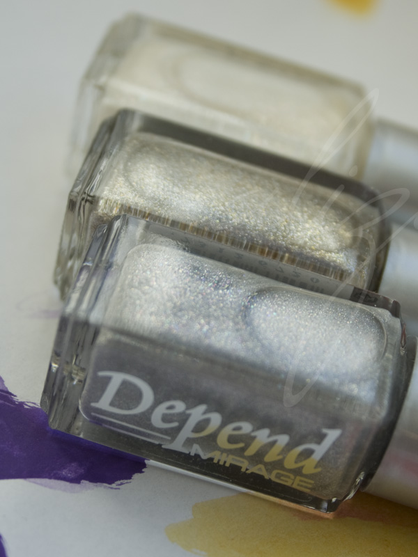
Front to back: 2051 Shattered Silver, 2050 Shimmering Sand, 2049 Fairy White.


Front to back: 2052 Golden Black, 2053 Treasury Gold, 2054 Glistening Green.


Front to back: 2055 Bronzy Breeze, 2056 Razzle Rose, 2057 Beaming Berry.


Front to back: 2058 Sheer Violet, 2059 Starry Blue, 2060 Twinkling Silver.


First impression of this collection is that it is a rather nice one, and some shades are actually very alluring, in a weird, delicate way. However, is the 60 % increase in price really necessary here? This limited edition collection is already in stores, and here in Sweden they go for a affordable but less tempting 39 SEK (~6 USD) - remember, Depend polishes always come in 5 ml bottles.

If you'd like swatches of any in particular, just give me a holler in the comments.

These products were sent for review.

Swedish word of the day:
hägring -noun mirage
Watch out for dehydration!

Friday, February 1, 2013

OPI in Euro Centrale - bottles and quick swatches

On OPI's journey around the world, the next stop is in central Europe to celebrate spring, with Euro Centrale. With that dreamy lede, I'd like to show you the bottles and quick wheel swatches.


Counter-clockwise from left: Vant to Bite My Neck?, Polka.com, You're Such a Budapest.


Counter-clockwise from top left: OPI... Eurso Euro, Can't Find My Czechbook, I Saw... U Saw... We Saw... Warsaw.


Counter-clockwise from top left: Hands Off My Kielbasa!, My Paprika is Hotter Than Yours!, Suzi's Hungary Again!.


Clockwise from bottom left: A Woman's Prague-ative, Oy - Another Polish Joke!, My Vampire is Buff.

And the wheel swatches:


Polka.com (small blue and magenta glitters, and larger blue, magenta and turquoise hex glitters in clear base), Vant to Bite My Neck? (vampy grape purple creme), OPI... Eurso Euro (saturated yet dark indigo blue creme).


I Saw... U Saw... We Saw... Warsaw (dark Prussian blue creme), Can't Find My Czechbook (turquoise-blue creme), You're Such a Budapest (lilac creme with subtle silver shimmer).


Suzi's Hungary Again! (bright pink-coral creme with fine silver shimmer), My Paprika is Hotter Than Yours! (bright warm red with fine silver shimmer), Hands Off My Kielbasa! (tan beige with fine coppery pink shimmer).


A Woman's Prague-ative (golden copper shimmer), Oy - Another Polish Joke! (yellow-golden shimmer), My Vampire is Buff (light beige creme).


Are you feeling the Eastern European vibe here? This surely is a collection full of stereotypes and simplification. Let's see... Two vampire jokes, three food and eating related names, three silly jokes with the pretention that local names have English meaning ...and, you know, the list goes on, in the usual OPI manner. We've learned to live with it, but sometimes it's bordering ridicule and exotism, which, by some more prone to analysis, could be perceived negatively. While Prague-ative is a less terrible play with words and names, the OPI team already used it once before, for It's My Prague-ative! (European Collection, 2002). The drained imaginations circulating the OPI offices are painfully obvious.

If we manage to forget the names for a while, they are actually plastered onto polish colors. Many good, some great, some less intriguing. The cool-toned half of the collection is bound to be the favourite of the less conservative youth, with the most outstanding member in the deep but vibrant indigo blue OPI... Eurso Euro. Can't Find My Czechbook is a very nice shade as well, though I think many lacqueristas will find that they have a bunch of similar colors already -that doesn't remove the fact that it is bright and tempting. The grape purple vampy Vant to Bite My Neck? is pretty standard, but the name alone will make some  people less hesitant, while the soft yet bright lilac subtle shimmery creme You're Such a Budapest is described by OPI as a periwinkle shade that I cannot see personally will lure many into its exquisit twinkle. Polka.com is an improvement in the glitter section compared to other recent OPI glitters with its two sizes of glitters, and for OPI a whopping three colors.

The warm-toned half of the collection holds the few more conservative colors, but that doesn't mean they are boring or suitable for your granny (unless she's utterly cool, of course). Except for the almost-but-still-not-really-nude My Vampire is Buff (the nicest and most ambiguous name of the collection), and perhaps the rather conservative Hands Off My Kielbasa!, this part has the super sizzling colors, like Suzi's Hungary Again! and My Paprika is Hotter Than Yours!, which are both exclamation colors despite their classic color families respectively. Unfortunately, they are struck with a fine silver shimmer that renders them slightly pearlescent - personally I would have preferred them as cremes. For those who like bronze and copper tones, A Woman's Prague-ative is a given; a gorgeous gold shimmer suspended in a sheer, brick red base. Last but not least, Oy - Another Polish Joke! was a surprise to me, as it's not just the yellowish golden shimmer apparent in the bottle, but also dries a little rough, which makes the shimmer reflect different colors and actually ...look kinda cool. Skipping the topcoat on this one could be beneficial for achieving a nice effect.

I found the formulas to be a wee bit different in this collection. While I'm used to a rather thin and easily spreadable product from OPI, some of these are a little on the chalky and/or gluey side. Nothing most of us can't handle, of course, but still a bit different. The shades with fine shimmer may require a more careful approach, lest we want visible brush strokes.

All in all, I like this collection, up to a like +. It's a nice palette of spring colors, ranging from cool to warm, from dark to light via bright. Although no one can love them all, everyone can like something. Note that this collection lacks a green shade - and I still like it. That is, if I disregard the silly names.


Any colors in particular that you wish to see full swatches of?

All products were sent for review.

Swedish word of the day:
Centraleuropa -noun Central Europe
We love putting words together into one long.

Friday, December 21, 2012

Depend spring 2013 bottles and more...

A quickie today to show you the coming spring colors from Swedish Depend Cosmetics - quite a colorful collection!


Pinks, peaches and oranges... 346, 347, 348, 349 and 350.


Turquoise, blue, purple and lilac... 351, 352, 353, 354.


...and green and yellow! 355, 356 and 357.

No wheel swatches this time, as Sweden proved to be too gloomy for any decent photography sessions. However, there is an interesting theme in this collection: several of the lacquers have a very fine green shimmer, mixed with sparse glass flecks. I wish the green shimmer was more prominent, but I love the idea, and for one of those recurring finishes throughout a collection that Depend seems to specialise in, it is a fun one. The orangey red 350, the turquoise 351, the lilac 354, the yellow 356 and the lime green 357 all have this combination of particles, while the sheer peach 349 is a more classic glassfleck. Then the cremes of course... Although not all of these are totally breathtaking and inventive, it's quite a cheerful bunch, which is something I like in a spring collection. Thumbs up from me this time.

The Depend peeps also sent a bunch of releases for Christmas, and among them were a few samples of a collection of chromes, foils or possibly metallics that go by the name Mirror.


A dark and gloomy wheel - this is 2048 Java Dusk, 2039 Pixie Pink, and 2041 Frosty Lilac.

Metallic? Sure. Foil? Perhaps, in some cases. Mirror like finish? Definitely not. But perhaps the name of the collection is not to be taken literally. There are also green and blue hues, among others, in this collection, but I haven't seen those - I wish I had, though. These few examples don't really tickle my fancy, but I'll always find use and the appropriate time for a good gunmetal shade, so I'm sure 2048 will be satisfactory to wear a good day.

All products were sent for review.

Swedish word of the day:
spegel -noun mirror
To be loved or feared...

Wednesday, September 26, 2012

Some Color Club Winter Affair

Color Club is doing their holiday collection in full size bottles this year too (remember when they used to release the mini sets?), and this year the collection is called Winter Affair. I snatched some of them - five out of six, actually - and here is three-ish of them.


Glitter Wonderland, three coats. Red leaning purple shimmer with blue micro glitters (very micro). I can never resist a good purple shimmer, and this one is a rather nice one.


Ho-Ho-Holly, three coats. Green golden foil. I love these blingy green foils! Totally hot in every way. This is the kind of green that easily escapes the eye of the camera though, but the bottom photo, which was shot in lower light, depicts the color pretty accurately. It's warmer than it shows the fully lit pictures.

And as the sun disappeared and the rain started to pour, I went all in and added the flakie topcoat Snow-Flakes (sic).


It's the variety that changes from orange via yellow to green (and a little blue in extreme angles - if you can catch it). It's not as dense as Essie Shine of the Times, but gives a good amount of flakes in one coat. Also present in these two photos is a glitter from Wet n Wild's Spoiled line, called Show Me the Money, that just happened to stand in front of me, asking to be added. The smaller gold glitters on the surface is the Spoiled, which also has green glitters that don't really show up in the photos. Yeah, I know, I was a little eager.

And now on to what all of you are probably wondering right now, and that is how this lovely green foil compares to Color Club's holiday green from two years ago, Magic Elf.


Ho-Ho-Holly (to the left) is apparently a couple of shades darker, and the gold particles are more dense, so they are not that close at all. Both do run a little sheer though, and for my nail length, the third layer was needed.

I have two more fom this collection, and hopefully I'll feel like wearing them and blogging about them some day soon.

These products were purchased with own funds,
except Show Me the Money, which was a gift.

Swedish word of the day:
affär -noun affair
not to be confused with
affär -noun shop, store
I somehow prefer the latter.

Wednesday, September 19, 2012

Depend fall 2012 - bottles and wheel

And now for something entirely different. An ordinary fall collection! And it contains very little (or small) glitter. Let's have a look at what Swedish brand Depend has to offer this season.


318 - mint green with frosty shimmer, 319 - nude creme in the pink spectrum, 320 - berry creme.


321 - dusty mauve-ish purple, 322 - strongly green tinged grey creme (or very greyed out green creme), 323 - berry shimmer.


324 - an ultramarine sorta blue creme, 325 - dark green with blue shimmer, 326 - teal green creme.


328 - sheer yellow jelly with yellow glitter, 330 - warm red jelly with dark pink glitter, 331 - sheer blue jelly with blue and purple glitter.


334 - candy cane like glitter, a warm white base with pink and unidentifiable glitters, 335 - small holographic glitters with a few small holographic hex glitters in clear base - the numbers in this photo have been mixed up! (sorry)

And directly to the wheel - for some reason these photos have a weird yellow tint despite using a correct white balance setting, but I've tried to color correct them back to reality, or at least as close to it as possible. All are three coats, no matter if they needed it or not (more on that later).

318, 319, and 320

321, 322, and 323

324, 325, and 326

328, 330, and 331 - for your convenience, I have topcoated this
group of swatches, but they are still rather gritty

334 and 335 - 334 is also topcoated, and not this yellow

All over the place, this fall collection as usually provides a little something for everyone, from the color fearing to the color embracing person. Thrown in, a bunch of hard-to-describe glitters - what are they supposed to be? This isn't all that clear. So let's begin by scrutinizing those (god knows I have been). At first glance, upon receiving these bottles, they caught my interest - what are they, really?! - and as I painted them on the wheel, I was more and more puzzled. I tried them as topping glitters over some of the other colors, I examined them in one coat, two coats, three coats... Fairly gritty, I was staring to wonder if they were meant to be. They sure aren't pretty, so perhaps they are meant for some new, weird, über-cool effect? I still don't know, all I know is I think the yellow 328 is absolutely terrible, 330 just doesn't work the way it's formulated, and 331 is worth a try on actual nails. As for 334, which seems to have a more opaque base, it still really catches my eye. A candy cane (Swedish polkagris) colored glitter?! I will have to try it, despite the doubts I have towards it's formulation and provided type of glitter. (335 is not worth more than a parenthesis - it's an unattractive variety of holographic glitter with very few slightly larger hexagonal glitters thrown in. In three coats I managed to fish up two of the hexes, barely noticeable in the swatch above because they ended up on the sides. There are far better options out there, just leave this one on its shelf.)

Let's move on to what is the more conventional parts of the collection, which is in part well done. There are plenty of repeats and bland colors, such as the two berry ones (320, 323), and the purple mauve 321. Then there are the ones that makes us think of what the huge brands are putting out, such as the grey balancing on green 322, and pink nude kind of color in 319, and then there are the completely uncomprehensible choice of putting the frosty mint 318 in this collection.

What does this leave us with? The blue creme 324, the green and blue shimmer 325, and the teal creme 326. I guess it wasn't that farfetched, reading this particular blog, was it? 324 may not be that original, but I always fall for those vivid blues - this one perhaps not the most vivid I've ever seen. Depend describes it as a cornflower blue, but I disagree and would like to call it an ultramarine blue. It's nice, but like too many shades in this collection it has an opacity problem. A three coater creme is not what I expect from Depend, and keeping in mind that these bottles are minis containing only 5 ml, that's basically a two-manicure bottle. 325 is a gorgeous shimmer if you happen to be a lover of greens, blues and teals. It is like the less fabulous sister of a Korean lacquer I was lusting over a long time, namely Skin Food Cucumber. If you can't get a hold of Korean products, but Scandinavian, pick this one up instead. A teal creme may not be that special, but 326 is a nice shade. I know all the subcultural teenage girls here will pick it up. It also has a pigmentation problem, but that renders it a little more squishy than your average one coater creme.

Another wordy review of a Depend collection. In large, this collection gets a pass from me, but just barely. The truly weird glitters kind of ruin the overall impression of it, which drags it down a notch or two. As usual, I'm sure everyone will find something to their liking here, which is still Depend's forte.

As a side note, though not required in Sweden, I have decided to start stating when products have been bought with my own money or when they were gifts for review by the manufacturer or a PR representative. I know many trust my honesty, and I refuse to change in my honest ways, but clarification could always be desirable, especially for residents of countries where stating acquirations is mandatory when blogging. You will find this note at the bottom of every post - I'll try to edit past posts to reflect this, to the best of my abilities, as well.

These products were provided by the manufacturer or PR representative for reviewing purposes.

Swedish word of the day:
spretig -adjective straggle
Best way to describe Depend collections - good or bad?

Wednesday, August 15, 2012

Orly Fired Up fall 2012 - quick bottles and wheel

I don't know what it's like where you live, but here in the surroundings of Stockholm, Sweden, you can almost feel the fall lurking in the air. Coincidently, we're served fall collections. I'm starting to grab for 'em vampy bottles - do you?

The Swedish representatives of Orly kindly provided me with their fall collection Fired Up for review, and here are some hasty photos for a first look.


Six shades of sultry fall femininity. Wheel swatches below are all at three coats each.


From left to right: Glow (nude beige creme), Flare (gold metallic shimmer), Flicker (orange metallic shimmer).


Ignite (cool toned cherry red jelly), Smolder (red metallic shimmer in plum purple base), Rapture (blackened brown creme).

A little low on light already at 8 PM here in August, so let's have a flashlit wheel photo as well (you may magnify if you're daring):


There you have it. Six vampy and glamorous shades. Three metallic shimmers, three in the creme division - of which one is actually a jelly, our beloved maraschino cherry red, this time named Ignite. If you're missing one, picking this one up might be a great idea. As a lover of red, I have quite a few members in this color family, but I can't say the same for oranges or golds, and when it comes to those I have very little to compare qualities with. But a gold is a gold, right? Could be a good staple as well. Nudes and blackened browns we have also seen before, but these areopaque and nice. Actually, all of these are nicely pigmented. Stated above is I did three coats of all - but only two of them needed the third: Flare and Flicker. The others are good in two coats.

I left one color out in the above paragraph, didn't I? Of course, because it's the star of the show. We may call her Smolder. Had these pictures been any better, you would have been able to see her glory. But don't despair, I'm wearing her right now. That means decent full swatch photos any day now.

It seems most of our beloved big nail brands are digging down those thrift find pockets for classic, vampy shades this fall. I won't complain, I dig vampies. A lover of vampies can never have too many - or can (s)he? Maybe when the shades look familiar. And I'm not just nodding towards long forgotten eras, but also contemporary compeditors. However, while there are striking similarities between these shades and some offered by the other big brand that starts with an O, there are also differences. I will be returning to this subject sometime within this week.

And all in all, as a collection, these go well together and present a sophisticated and mature unit. If that's what you want, Fired Up is full of win.

Swedish word of the day:
mogen -adjective I ripe II mature
This fall may have both.